UI/UX Case Study: Improving and Revising the Design of Super Wallet App
Introduction
The Tokenizer platform offers an all-in-one platform that enables users to spend, save, buy, earn, and invest in crypto and fiat. Tokenizer operates as the super app for digital asset investment and portfolio management.
EXISTING PRODUCT ISSUES
When I took over the design of the Super Wallet app, it was clear that significant improvements were needed. The initial design lacked user experience (UX) research, which manifested in several critical flaws:
Missing pages and incomplete user flows, particularly in the registration process.
Inconsistent use of fonts and styles, leading to a disjointed user interface (UI).
Redundant and repetitive navigation elements, making the app cumbersome to use..
No design system in place, resulting in a lack of cohesion and efficiency in the design process.
PERSONA
Active Crypto User Age: 25-45 Occupation: Tech-savvy professionals, traders, and investors Tech Proficiency: High Motivations: Securely manage multiple cryptocurrencies, track portfolio performance, execute transactions efficiently Frustrations: Complexity in navigation, inconsistent UI, incomplete registration steps
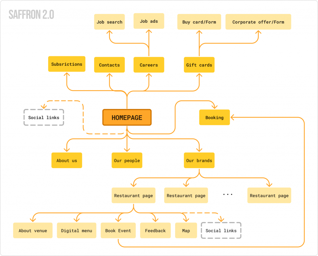
OLD STRUCTURE vs NEW STRUCTURE
TBD
DESIGN SOLUTION
TBD
TBD
TBD
TBD
TBD
TBD
TBD
Results and Metrics
To address the identified issues, I undertook a comprehensive redesign, focusing on several key areas:
TIMES
x0
Adaptive Design: Implemented responsive and adaptive design principles to ensure a seamless user experience across various devices and screen sizes.
★★★
TBD
Integration with Material 3 Standards: Updated the UI to align with Material 3 standards, enhancing the visual appeal and improving performance. This integration made the app faster and more intuitive, leveraging the latest UI patterns and components from Google’s design system.
FASTER
0%
File Structure and Hierarchy: Supervised the restructuring of design files, creating a clear and logical hierarchy. This organization made the files easier to navigate for developers and other designers, streamlining the collaboration process.
FASTER
0%
Design System: Developed and implemented a comprehensive design system. This included standardized components, typography, color schemes, and iconography, ensuring consistency across the app. The design system was aligned with the corporate brand, reinforcing brand identity and coherence.
Learnings
Throughout this project, several key learnings emerged:
Importance of UX Research: Conducting thorough UX research is crucial in understanding user needs and pain points, which directly informs design decisions.
Consistency is Key: A consistent design system not only enhances the user experience but also improves the efficiency of the design and development process.
Adapting Standards: Integrating established design standards, such as Material 3, can significantly improve both the visual and functional aspects of an app.
Collaboration and Communication: Clear file structure and hierarchy facilitate better collaboration among team members, making the design process more efficient and effective.
Continuous Iteration: Design is an iterative process. Regular testing and feedback loops are essential to refining and enhancing the user experience continuously.